Thessalonikios (Θεσσαλονικιός)
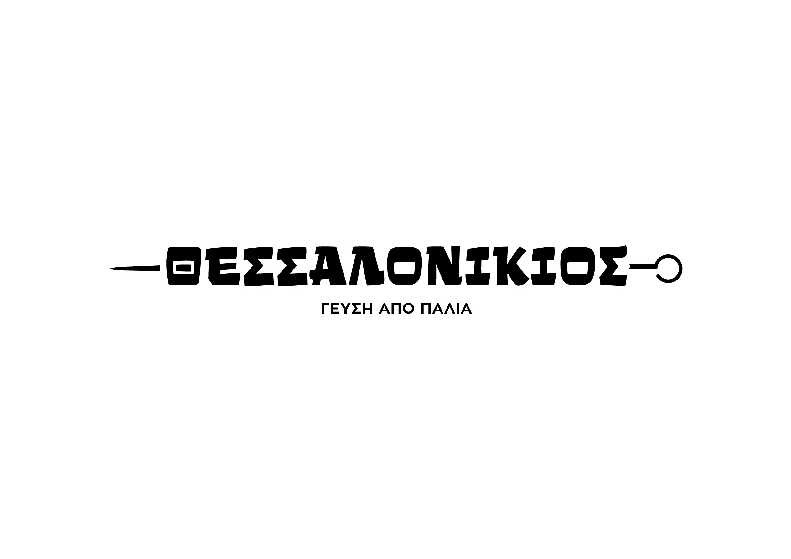
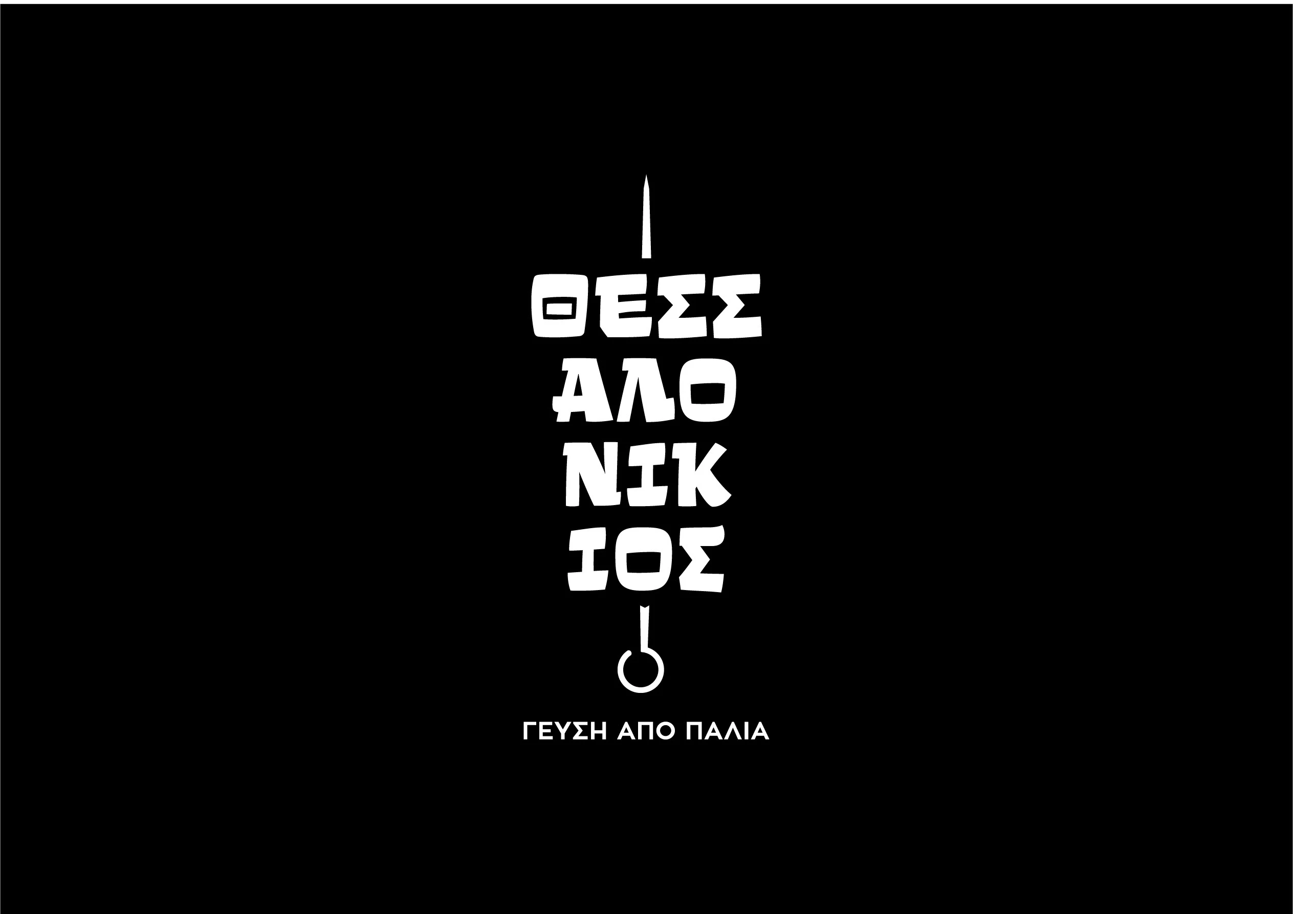
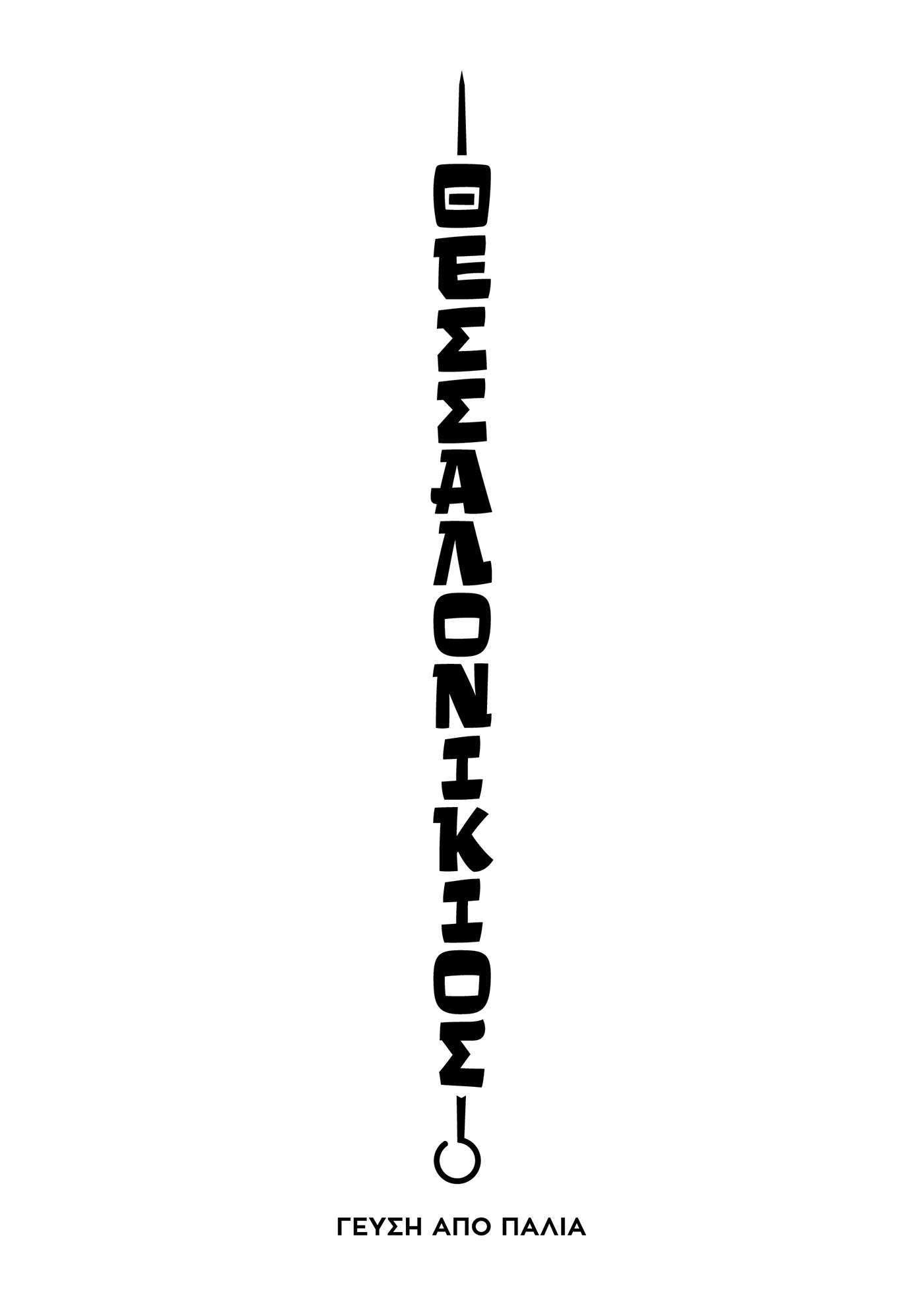
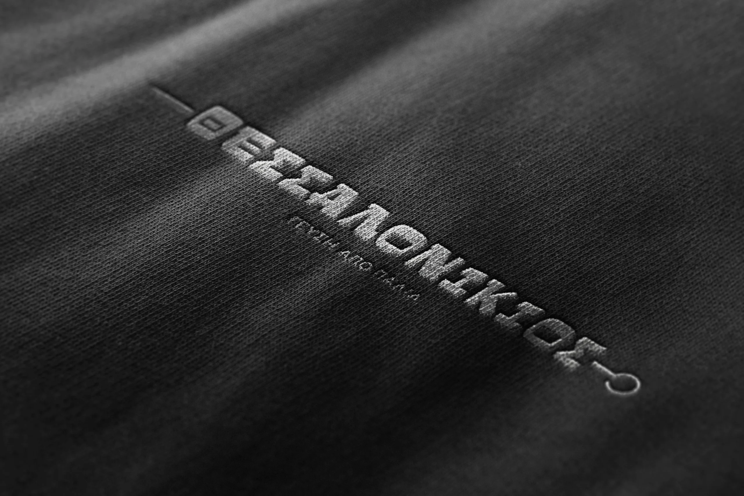
We decided to keep it simple. No fancy symbol, just text. We selected and old school blocky typeface, CF Klak which is an uppercase display font inspired by the lettering used for the advertisements of Greek movies of the ’50s, ’60s and ’70s – a direct reference to the history and age of the original establishment. The familiar look of the typeface (old Greek films of the time are really popular) also reinforced the feeling of familiarity, of “an already established shop” that we wanted, as well as the feeling of nostalgia of a bygone era.
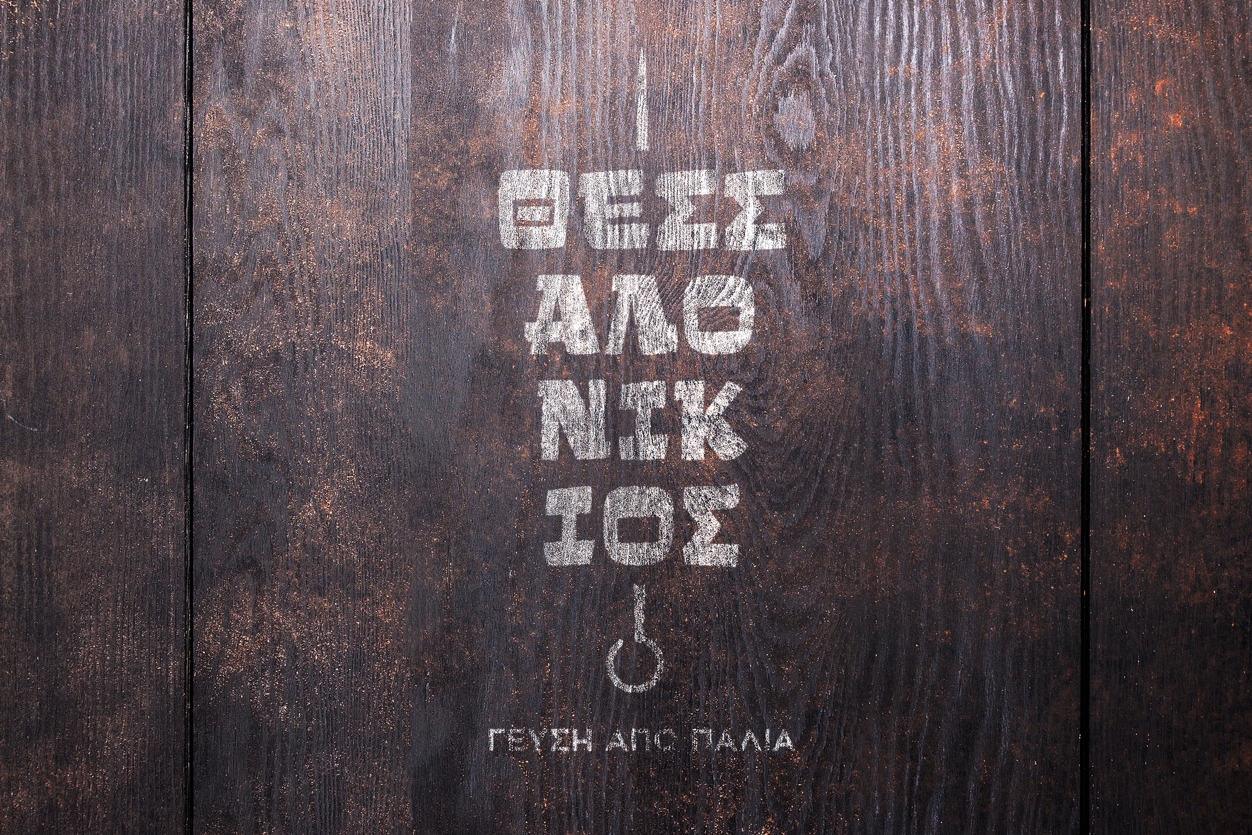
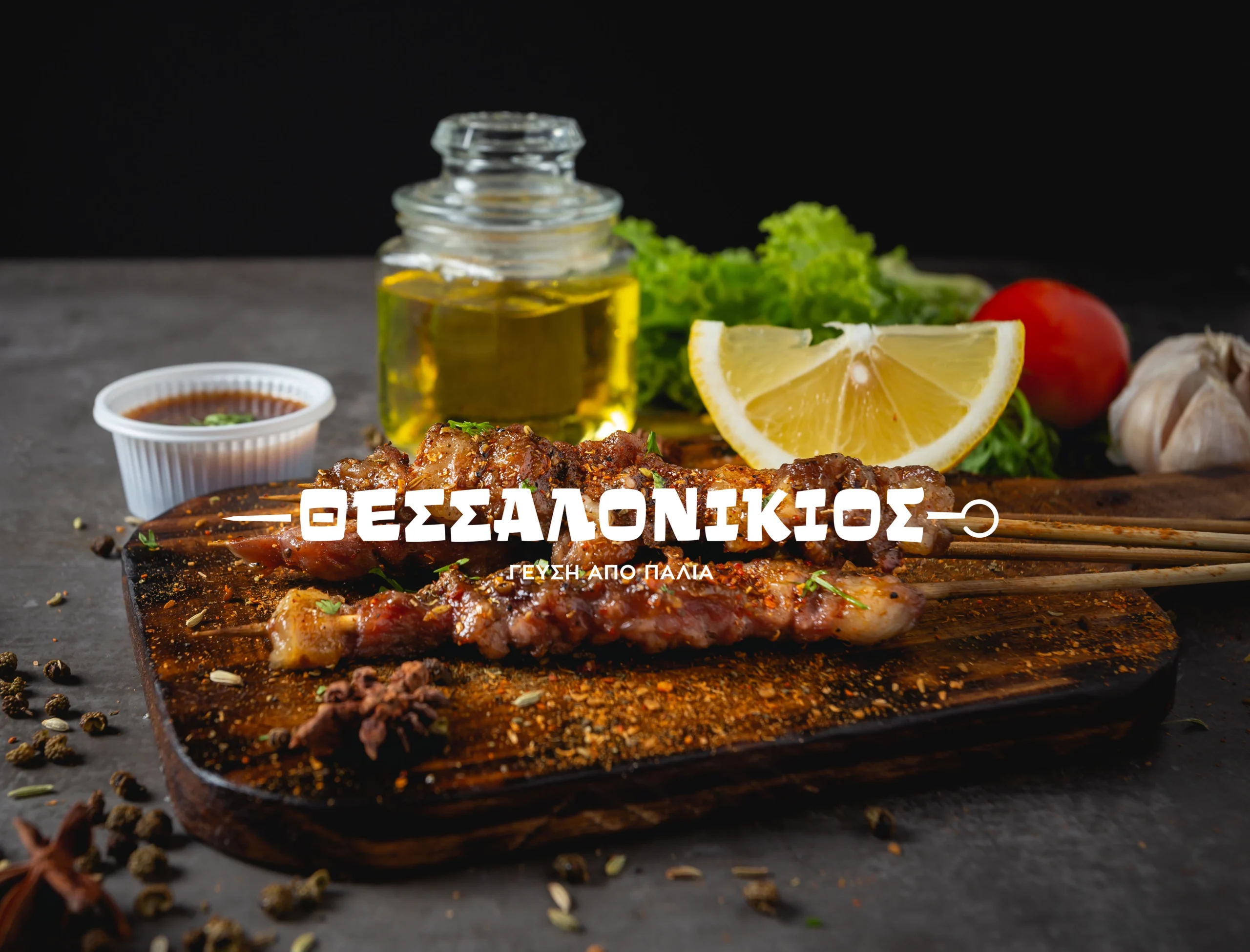
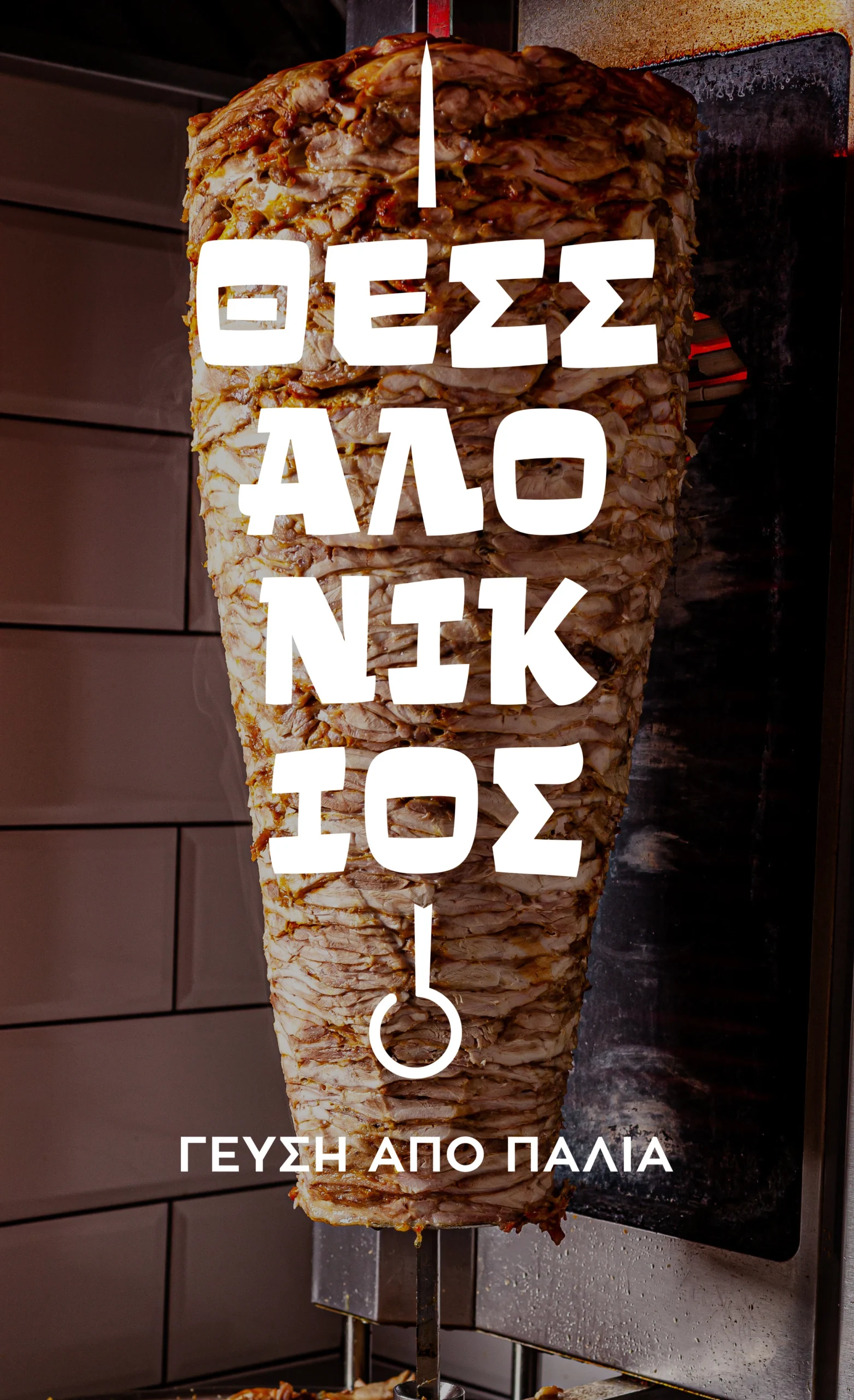
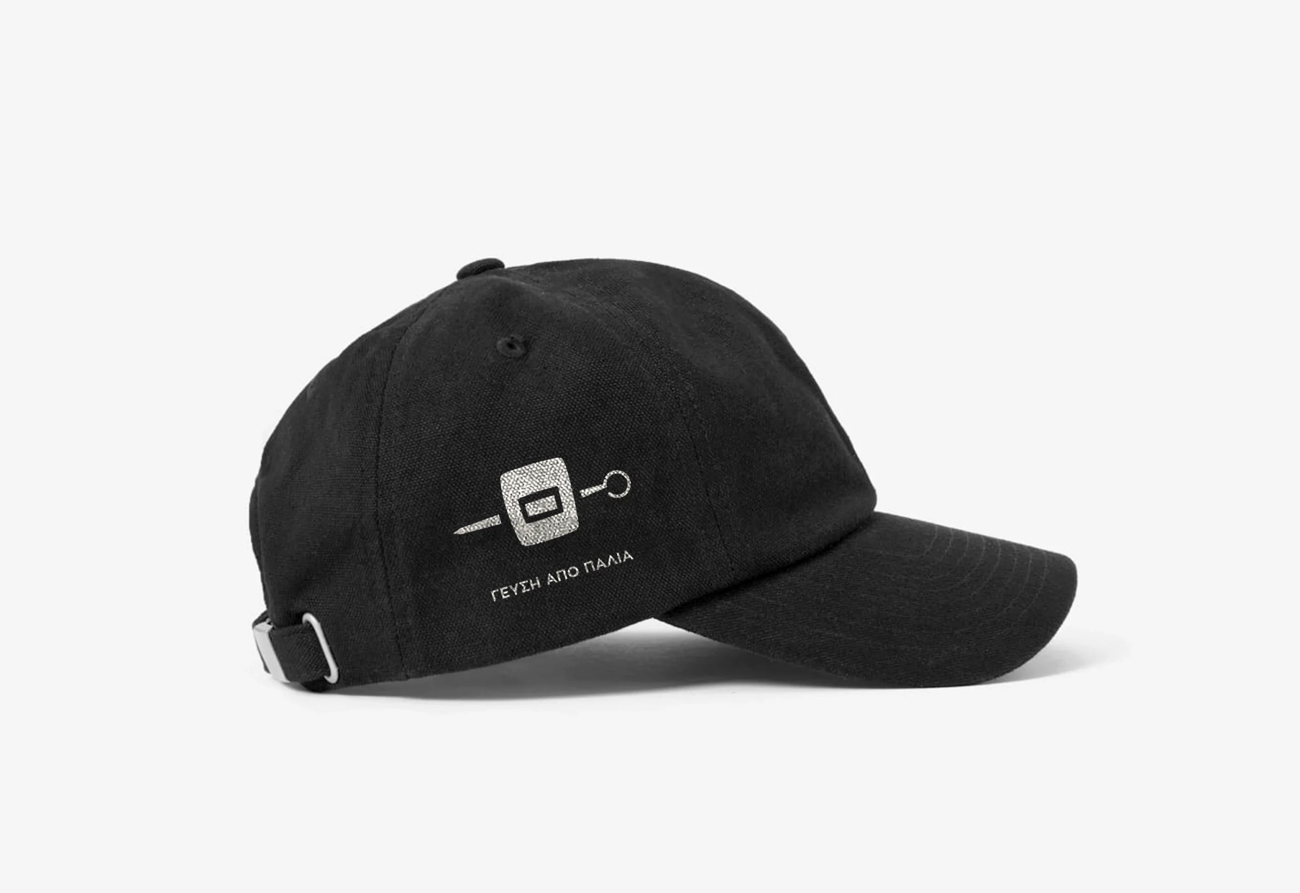
The logo itself takes advantage of the font’s shape to create the most recognized dish – the souvlaki – the letters acting as pieces of meat on the souvlaki. Due to space limitations, the logo was designed as “responsive” and is able to adjust so it can fit in any place. It also transforms into the second most recognized dish – the Gyros. An additional icon was designed for small spaces or online use.